5 Logo Design Trends to Watch in 2016
ADRIENNE WOLTER | 23 JUNE 2016
Picture Starbucks.
I’m willing to bet that most people reading this, in addition to thinking longingly of their favorite Starbucks beverage, conjured up a mental image of the Starbucks logo and the unique shade of forest green used therein.
Logos are a huge part of a brand’s identity; they are the visual shortcut that brings that brand to mind in your brain. There’s even a logo identification board game so you can test which of your friends can recall the most logos.
Logos are so recognizable that it’s no wonder logo redesigns can be so controversial; even if a logo has become outdated or out of touch with the current state of the product, changing a logo involves changing the visual identity of a brand. It’s hard to change something people are already incredibly familiar with.
Still, there are a lot of benefits to updating an existing logo or creating a new logo to match the times. For one, your brand will look more in-step with present-day trends. Secondly, trends tend to mirror what is most appealing with people at the time, so by creating a logo informed by current trends, you are likely creating a logo that will be universally appealing.
This post will cover some of the biggest logo design trends of 2016, with examples and advice for making a given trend work for you.
Flat Design
The flat design trend was largely fueled by Apple’s move away from skeuomorphism, and Google Material Design, a set of stylistic guidelines for app creators that blends flat design with some of the best features of skeuomorphism.
Flat design does away with a lot of the gradients, shadows, and 3D rendering used to make interfaces on a screen feel more “real.” Modern users, having often grown up entirely in an age of screens, no longer need the associations with real world equivalents to find their way around an interface.
With some of our most familiar interfaces flattening out, it is only natural that other designs would follow.
Brands are moving to simpler, smoother, and flatter versions of their logos that look great, no matter what size of screen they are displayed on. And sometimes those screens are quite small.
The flat design trend has inspired a number of logo redesigns in the last few years, most notably Google in 2015 and Instagram in 2016.
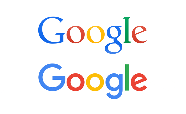
Google’s redesign is not overly dramatic, but it does perfectly illustrate the shift to modernity that Google was going for.
First of all, after 16 years of serif, the switch to a sans serif font pays homage to the growing number of mobile devices in use; sans serif fonts are almost universally accepted as easier to read on screens.
Where the old logo had some subtle highlights and shadows on the letterforms, the new logo is totally flat.
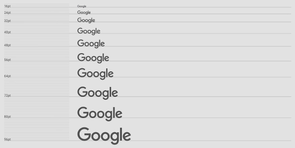
Plus, it is easier to read even at increasingly small sizes:
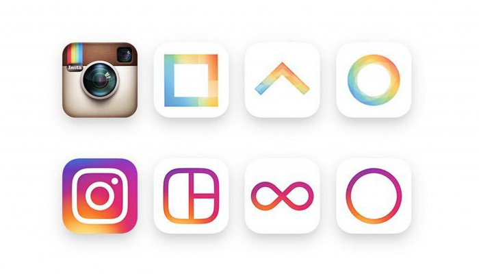
Instagram’s redesign, on the other hand, turned heads for how dramatic it turned out to be. Though I see similarities in Instagram’s older mini-apps (which came well after the original logo) and the new design, the new design is a complete diversion from the old, super skeuomorphic app icon.
Minimalism
Where flat design has come to smooth out and flatten older logos, minimalism has come into play to pare them down. Every brand wants their logo to be iconic; some brands have even dropped the text from their logos entirely, instead opting for a single shape to represent their brand. It can be a risky move, but in some cases it absolutely pays off.
Minimalism can show itself in logo design in other ways, as well. Many logos designed in previous decades tried to imbue a lot of meaning in a small space; however, in an era of technology, these detailed logos translate poorly to the screen.
Minimalism has been the inspiration for many recent redesigns, including that of Oculus VR in 2015 and the Peace Corps in 2016.

Oculus VR is the company behind the well-known virtual reality headsets. Their original logo was neither poorly designed nor very old, but the new design is undoubtedly more iconic, dropping the eye and the wordmark for a single swooshing oval. As well as implying the O at the start of their name, the new oval logo mirrors the distinctive shape of their headsets.

The Peace Corps has been sending college-educated Americans abroad for volunteer work since its establishment in 1961. Since its inception, the logo has tried to impart the idea of an all-American star transforming into a dove, but the resulting middle steps have always closely resembled a “mutant starfish.”
The new logo does away with this concept entirely (finally!), instead streaming a series of red and white stripes and pulling the newly sans serif wordmark to the side. The resulting design is much more minimal, flat, and enjoyable to look at.
Neon Colors
I’ve written about this before, but in the last year we’ve been seeing a lot of brands going neon, and it’s a trend we’re going to continue to see throughout the rest of 2016.
Whether this is a move to court oddball color loving millennials or just stand out on increasingly noisy home screens, the number of brands brightening up their logos is pretty astounding.
Spotify led the way with a bright new shade of green in March 2015:

Medium followed in the same vein in October of that year:

More recently, in March 2016, Children’s BBC (or CBBC for short) updated to this imaginative new logo:
And just recently, in May, StubHub joined the neon bandwagon:

This is a trend I know we haven’t seen the last of yet.
Handmade Look
On the exact opposite end of the spectrum from the minimal, flat logo designs that are taking center stage this year are those that look almost hand drawn.
These logos often take advantage of other trending design elements – such as watercolor and hand-lettering – to take the form of a highly-detailed and beautifully rendered miniature piece of art.
Along the same lines is the resurgence of “vintage” logos, that combine old dictionary-style imagery and “retro” shapes and fonts for a logo design that brings to mind craft breweries and farm-to-table restaurants.
Here are some great examples by Autumn Lane Paperie:
Animated Logos
Last but not least is one of my favorite new trends in logo design: animated logos! These are still relatively uncommon, but they are growing in popularity as brands become less concerned about the printability of their logo and more concerned about how it will look on screens and digital interfaces.
Google, of course, has jumped on the animated logo bandwagon with a “four dots” logo concept that ties together all their different products and properties:
Eir is one of the largest telecommunications companies in Ireland, and in late 2015 they went through a brand identity update that included, among other things, this colorful animated logo:
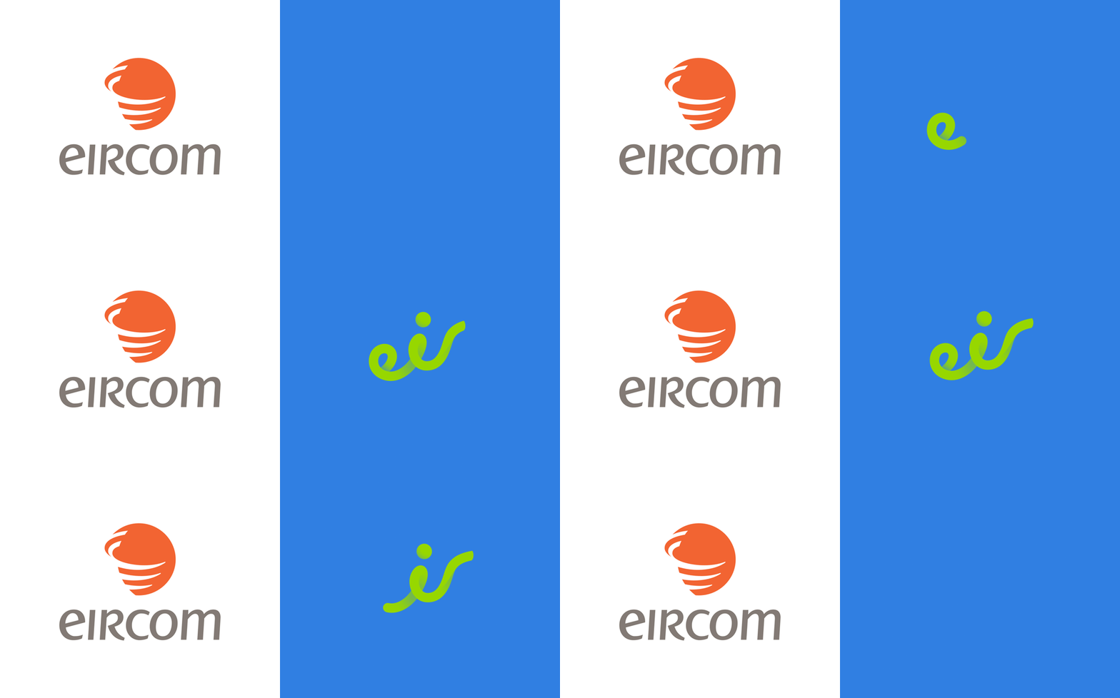
The animated logo trend is another one I am sure we’re going to see more and more of in the years to come.
Wrapping Up
This is in no way an exhaustive list of logo design trends; we have no way of knowing yet what trends will come to the forefront as we enter the second half of the year. However, these five trends really have come to define the past few months and parts of 2015.
We really are seeing logos head in two directions this year. On one end of the spectrum, logos are getting smoother, flatter, and more colorful in a nod to flat design. On the other end, we are seeing logos becoming more organic, intricate, and hand-rendered, especially for small craft and lifestyle brands. Only time will tell which of these styles will last and which will be swept up in a wave of future redesigns.
What other logo design trends do you see coming to the forefront in 2016? Share your favorites, and examples you love, in the comments below!

