The Psychology of Fonts & Their Impact on Conversions
ADRIENNE WOLTER | 11 FEB 2016
Ask any designer or even font enthusiast and they will be quick to tell you: there is more to font selection than picking serif or sans serif.
Typography and the way text is laid out on the page or screen has a measurable impact on our mood.
Well-designed typographic layouts can make us relieved and even happy; poorly-designed layouts can have the opposite effect, frustrating us and stressing us out.
Font choices can lend meaning to an otherwise static passage, and some font choices are even shown to change how credible we believe information is.
For all these reasons and more, font choice can have an impact on your bottom line. Keep reading to learn more about what happens in our brains when we take in a font, and how to use that information to increase your conversion rate.
Font Associations
We all have automatic associations with the fonts we see all over the world around us. They may not be totally universal, but they can still be largely grouped into a few basic emotional categories.
Take Helvetica. Helvetica was designed to be a neutral, modern typeface by a Swiss designer in 1957. Americans know this font well, even if they wouldn’t be able to identify it by name. It is the standard font for New York City’s Metropolitan Transportation Authority and Philadelphia’s SEPTA. It is heavily used by the U.S. government for official documents, most notably our income tax forms. All these associations have given Helvetica a very official, informational feel.
Serif Font Associations
Serif fonts are those with small strokes attached to the ends of the lines that make up each letter. Nobody is quite sure where serifs came from, but one theory is that carvers chiseling text into stone in ancient times used the serifs to neaten the ends of the letters.
Serif fonts have long been believed to be the most legible on paper, though more recently this research has been questioned. Serif fonts are traditional, trustworthy, and have more of an air of formality than cleaner, sans serif fonts.
Sans Serif Font Associations
As the counterpoint to serif fonts, “sans serif” literally means “without serifs.” Sans serif typefaces appeared in the early 1800s and were originally called “Grotesque” because they were such a huge departure from tradition.
Sans serif fonts are popular for screens, especially lower-resolution screens, because at lower-than-ideal resolutions, the tiny serifs can get lost or obscure the rest of the letter. At higher resolutions, this is less of a concern. Sans serif fonts are clean and modern; thinner sans serif fonts have an informal or modern feel, while thicker sans serif fonts (such as Helvetica) have more of an official feel.
Script Font Associations
Cursive originally came about to accommodate fragile feather quill pens, which made frequent lifts off the paper difficult. Many of us had to learn cursive writing in our early years of school, and the lessons may or may not have stuck. Script or cursive fonts are much harder to read quickly than the previous two types and are therefore reserved for headings or for very formal documents (such as certificates and diplomas). They give an air of formality or fanciness.
Display Font Associations
Display fonts are hard to classify, since they can take many varying forms. They are generally displayed at larger sizes and are only appropriate for headings. They can elicit a wide array of emotions and may seem cartoonier than standard fonts.
How Typography Impacts Our Mood
From a typeface standpoint alone, the fonts you select for your website, social media imagery, and marketing materials are already having a psychological impact on your potential customers. But there are other qualities of how text is laid out on the page or screen that can have a dramatic impact on how that content is perceived.
Font Size
Over time, the web has been trending towards larger font sizes. In 2009, a Smashing Magazine survey found 13pt was the most common height for body copy on the web. Two years later, they declared 16pt as the new preference. Many websites well-known for their written content even go bigger than that. Crew notes that currently, the blog Zen Habits uses 21pt for body copy, and Medium uses 22pt.
Up to a certain extent, larger font sizes take less effort to read. They also adapt better to varying screen sizes.
Line Length
Line length, which is determined both by the size of your text and the size of its container, is a subtle but important part of designing legibility on your website. The ideal line length falls between 50 and 75 characters; this gives the reader room to fall into a speedy rhythm but doesn’t make it difficult to find the right place at the left side of the page or screen once they reach the end of the line.
Spacing
Spacing, or line height, is another subtle part of typographic design. Tight paragraphs are hard to read because the lack of room between the lines can make it difficult for your eyes to find the right row when you reach the end of the line. More open paragraphs are easier to read and the added white space makes them feel airier and friendlier.
Readability
In one study, researchers presented participants with an article laid out for a newspaper. There were two versions: one was well-designed, with indented paragraphs, a properly-placed image, and good headers. The other version was designed very poorly, with poor headers, no indentations, and an image placed smack dab in the middle of a paragraph.
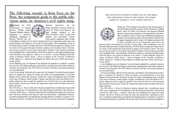
After completing the reading, participants were given a logic puzzle to solve within a time limit. Forty percent of those who read the well-designed version solved the puzzle correctly within the allotted time. Meanwhile, none of the nine participants in the second group, who had read the poorly-designed version, were able to solve the puzzle correctly.
When surveyed, the participants said that the well-designed version (at right in the image above) was easier to read, was easier to understand, and gave them more of a sense of feeling in control. The researchers noted that those who read the poorly-designed version felt worse while reading, to the point that some of them even frowned.
Readability, the sum total of all the qualities above as well as your choice of typeface, obviously has a huge impact on happiness, ease of understanding, and even cognitive performance.
Using Typography to Increase Conversions
With all this in mind, you may be wondering how typography can impact your bottom line. Your content’s readability influences how well your visitors understand your content, as well as how trustworthy they find it to be.
Easily read content is more easily comprehended content. Especially for parts of a website that emphasize reading, like on your blog, it is very important to choose a legible font and choose attributes that do not easily fatigue your reader (large enough font size, proper line length and height). Make it easy for them, and your visitors will spend more time reading content on your website, which may help them make the decision to buy.
But the true power of the psychology of fonts is in increasing your brand’s trustworthiness. Multiple studies and experiments have shown that typeface can have this power.
In a blog post, Crew showed the impact (har har) that a simple switch in font can have on the trustworthiness of the Bank of America website:
With Impact replacing their normal sans serif font, the site looks far less trustworthy, not to mention way harder to read. In addition, Impact has its own associations: personally, it makes me think of crudely designed posters hung on my college campus and the font used by annoying banner ads.
In a 2006 blog post, web designer Phil Renaud shared his incredulity that out of 52 college essays he had written six semesters into college, the average grade varied depending on the font he used. These were his results:
- Times New Roman: A-
- Trebuchet MS: B-
- Georgia: A
This is how each font looks at 24pt:
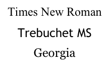
His theory was that in an academic setting, a serious serif font was taken more seriously and was easier to read in print. Times New Roman was the norm; his papers in Georgia perhaps stood out enough to make a minor impression on the professor – perhaps even enough to earn an A rather than an A-. If only I had heard about this in college!
Of course, these are very anecdotal situations. Inspired when he found Renaud’s article, in 2012, New York Times columnist Errol Morris set out to take a more scientific approach.
Morris ran a quiz one week asking the question, “Are You an Optimist or a Pessimist?” It spoke about near-misses of the earth by colossal asteroids, and included a passage by physicist David Deutsch, explaining why humans of our era are better prepared than ever to defend ourselves from destruction by asteroid. The article ended with a short quiz asking readers if they agreed with Deutsch and how confident they were in that belief.
Unbeknownst to the vast majority of Times readers, Deutsch’s paragraph was displayed at random in one of six different typefaces: Baskerville, Comic Sans, Computer Modern, Georgia, Helvetia, and Trebuchet. He was measuring what kind of impact the font choice had on the credibility of Deutsch’s statement.
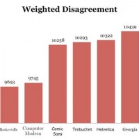
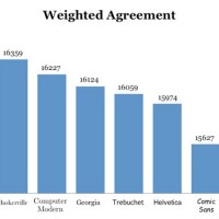
Here are the weighted results:
Incredibly, Baskerville had a remarkable affect on his readers. Those presented with the statement in the font Baskerville were much more likely to agree with the statement and much less likely to disagree with the statement. Unsurprisingly, Comic Sans had the opposite effect.
This is not to imply that Baskerville is somehow a magical font that can make people more likely to believe what they are reading; however, in this situation, it did look and feel more formal, lending authority to Deutsch’s statement. Does your sales page impart the right level of authority and create the right associations in your visitors’ minds?
Wrapping Up
How you use typography on your website can clearly impact how your visitors perceive your content and brand.
You need to be mindful of preexisting associations your users have for fonts. Helvetica might say “modern” to you, but scream “tax forms” to your audience. And don’t stop at choosing the typeface; you will see the best results from a website that is well laid out in other regards.
If you’ve got everything right, the effect of your typography will be an all around easier to understand and easier to trust website.


