8 Web Design Trends Finding Their Stride in 2016
ADRIENNE WOLTER | 13 JAN 2016
The internet moves quickly, and nowhere is that truer than with web design.
At the start of every new year, web designers all over the world stop to compare notes about the overwhelming trends from the past year and those that they predict will be a big deal during the coming one.
In 2015 we saw responsive design become firmly cemented due to Mobilegeddon, Google’s algorithmic change to prefer mobile-friendly websites in mobile results.
Whether the April update had much of an impact on your search engine ranking or not, this change was the concrete deadline that had many businesses finally going mobile last year.
The average internet connection speed has been on the rise over the past few years due to the spread of services like Google Fiber and its competitors.
This increase is allowing for richer media experiences on the web, from high-quality, full-screen images to immersive designs featuring video.
This year also marks a shift from not just looking stunning, but also stunning the visitor with delightful experiences.
Greater attention than ever is being paid to user experience (UX) and the overall functioning of a website.
With these thoughts in mind, let’s take a look at eight of the biggest web design trends we will see really come into their own in 2016.
1. Flat Design
Yes, flat design has been on everyone’s radar ever since Apple’s dramatic shift away from skeuomorphism in 2013, and in the years following, all kinds of on-trend apps and websites embraced everything flat, with mixed results.
First, the pendulum swung too far in one direction, toward designs so flat that they lost all friendliness and intuitiveness.
Then the pendulum swung back again with the release of the Apple Watch, because skeuomorphism is just really good at teaching people how to interact with new technology.
In 2016, the trend has settled somewhere in between, with blocks of solid color and simple interfaces, but with a touch of shadow and depth where it’s needed to improve the user experience.
Google’s Material Design is the embodiment of this happy medium, lending real-world physics to digital interfaces.
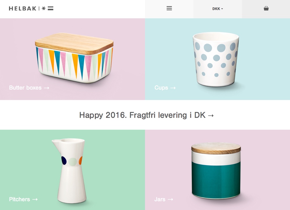
Helbak Ceramics’ bright and cheery products embrace swaths of simple and solid color on white, so it is only natural that their website be an extension of that aesthetic.
Pastel tiles feature different product lines, which subtly highlight on hover. Still, they aren’t afraid to give the illusion of depth – each product has a subtle shadow.
2. Bold Color Choices
Along with Apple’s shift to flat design came a widening of their color palette. By flattening out all those icons, they allowed for brighter shades to shine through.
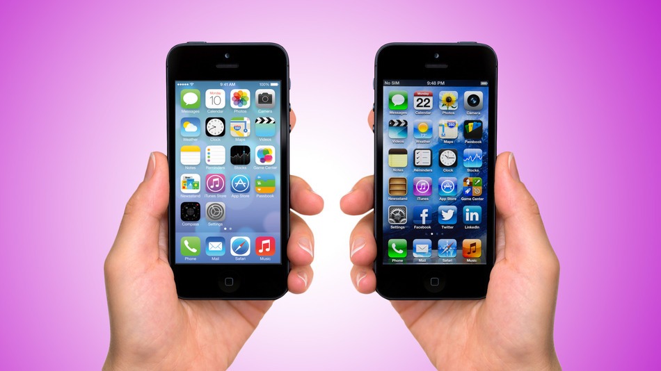
iOS 7 vs. iOS 6. Image: Mashable
Apple’s not the only one. In 2015, we saw a trend of “neonification” in new logo designs:
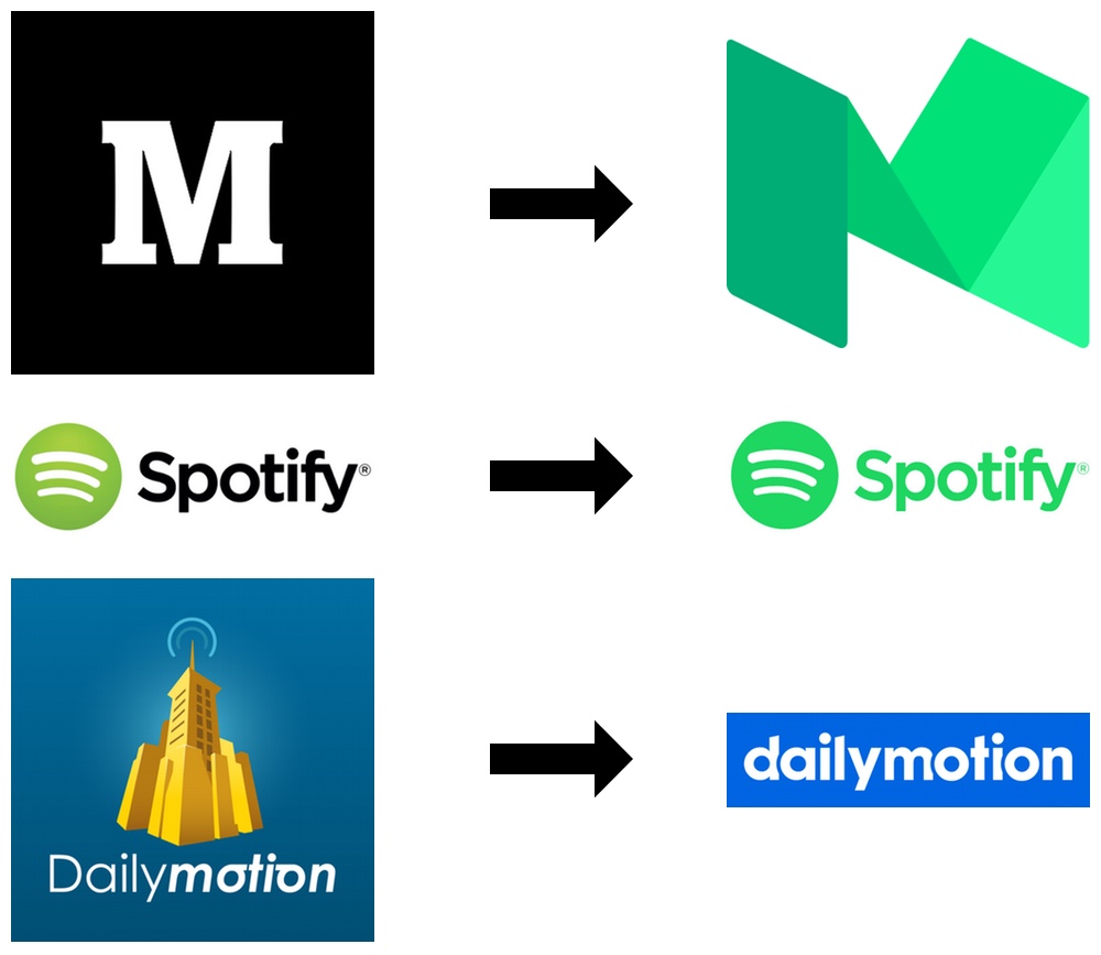
Medium, Spotify, and Dailymotion were just three well-known brands to flatten out and brighten up their logo designs in 2015.
Each was met with some amount of distaste, especially Spotify’s new logo. Spotify users woke up one summer morning to find that their app icon had gone neon, and they expressed their hatred on Twitter. The company defended the color choice, saying it gave them that extra amount of “pop” they needed to appeal to millennials.
In 2016, we are sure to see more brands brighten up their logos and branding – but perhaps with a little more restraint than in Spotify’s case.
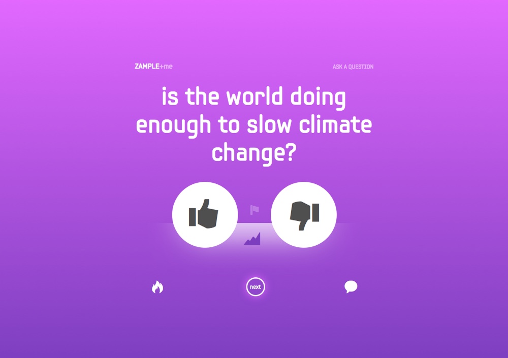
ZAMPLE+me is a public yes/no polling tool. Every question lives on a page where color plays the starring role: a gradient fills the entire screen, only interrupted by the white of the question and icons. Every new question appears on a new color background. Though the color is bright and all over the place, the transition to a deeper shade keeps it from being overwhelming.
3. Impactful Typography
Web fonts are getting easier to implement and more readily available for free from services like Google Web Fonts, Font Squirrel, and Adobe Edge Web Fonts. All of these tools make packing a punch with typography all the more accessible.
In 2016, we are going to keep seeing creative things happening with web fonts. Whether this involves pairing a surprisingly stunning pair of fonts, layering and animating text in creative ways, or even just using type as a central focal point that packs a punch, there’s a lot more still to come out of web typography.
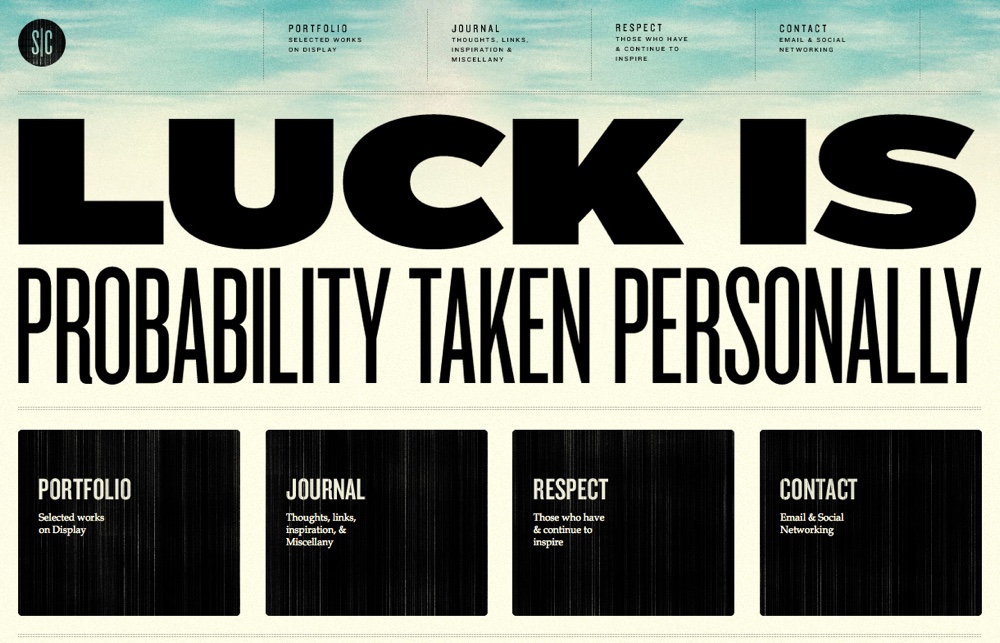
On Stephen Caver’s eye-catching portfolio website, typography shines. The main tagline takes up so much of the screen that it becomes a sort of hero image, and the bold/thin font pairing is a nice accompaniment to the black blocks below.
4. Full-Screen Hero Images
Love them or hate them, the hero image is officially here to stay. Nothing sets a website apart as easily as a big, bold, and beautiful hero image.
In 2014 and 2015, when the trend emerged, we mostly saw hero images as a wide image over top of other homepage content; in 2016, they are becoming the homepage content. Hero images are going big by going full-screen.
Faster internet connections are keeping these impactful headers and backgrounds crisp even as they scale to fit larger and larger screens.
Designers are also delving into other media; besides still images, in 2016 we will see hero areas featuring video and animated content.
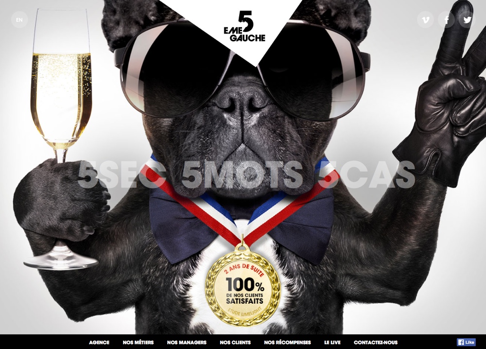
5ème Gauche is a French digital marketing agency that has embraced the “go big or go home” mentality for their homepage with this off-the-wall, full-screen hero image.
5. Split Screen CTAs
A split screen is a bold way to give equal attention to a set of CTAs – dividing men’s and women’s clothing on a fashion website, for example, or home and business products on a software website.
The obvious division makes it quick and clear to navigate to where you want to go, without having to dive into a menu.
In 2016, we will see split CTAs more and more as websites work to create more personalized experiences for their users. By narrowing down the target audience from the start, you can more easily present exactly what that subset of your visitors is searching for.
By narrowing down the target audience from the start, you can more easily present exactly what that subset of your visitors is searching for.
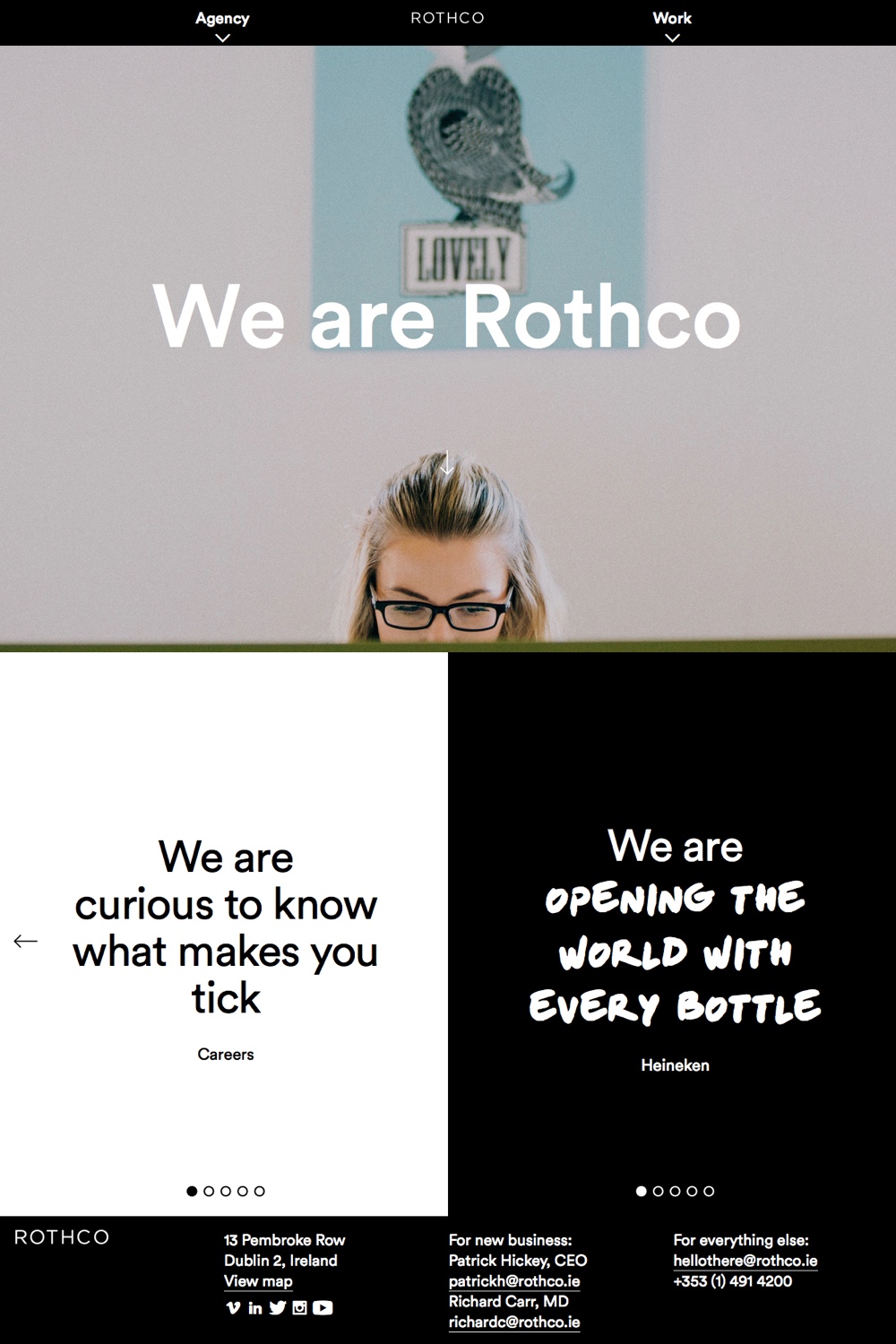
Rothco is an Irish advertising agency. They clearly have decided to divide their website up visually to present two clear purposes: information about their agency and examples of the work they have done. The website mimics this visual division elsewhere on the site, also using rollover images to bring more color and interest to the design.
6. Long Scroll Designs
Scrolling is a natural way to navigate – we are comfortable with the spin of the scroll wheel, the slide of fingers down a touchpad or a smartphone. It is a far simpler barrier to entry than having to click through lots of individual pages.
It is a far simpler barrier to entry than having to click through lots of individual pages.
As internet speeds grow, so will the one-page trend. A common feature of these designs is predefined “pages” or slides within the long scroll design; as you scroll, you will automatically be popped down to a new section. This makes it easier to ensure that the design feels and functions the same way across different devices, browsers, and screen sizes.
This makes it easier to ensure that the design feels and functions the same way across different devices, browsers, and screen sizes.
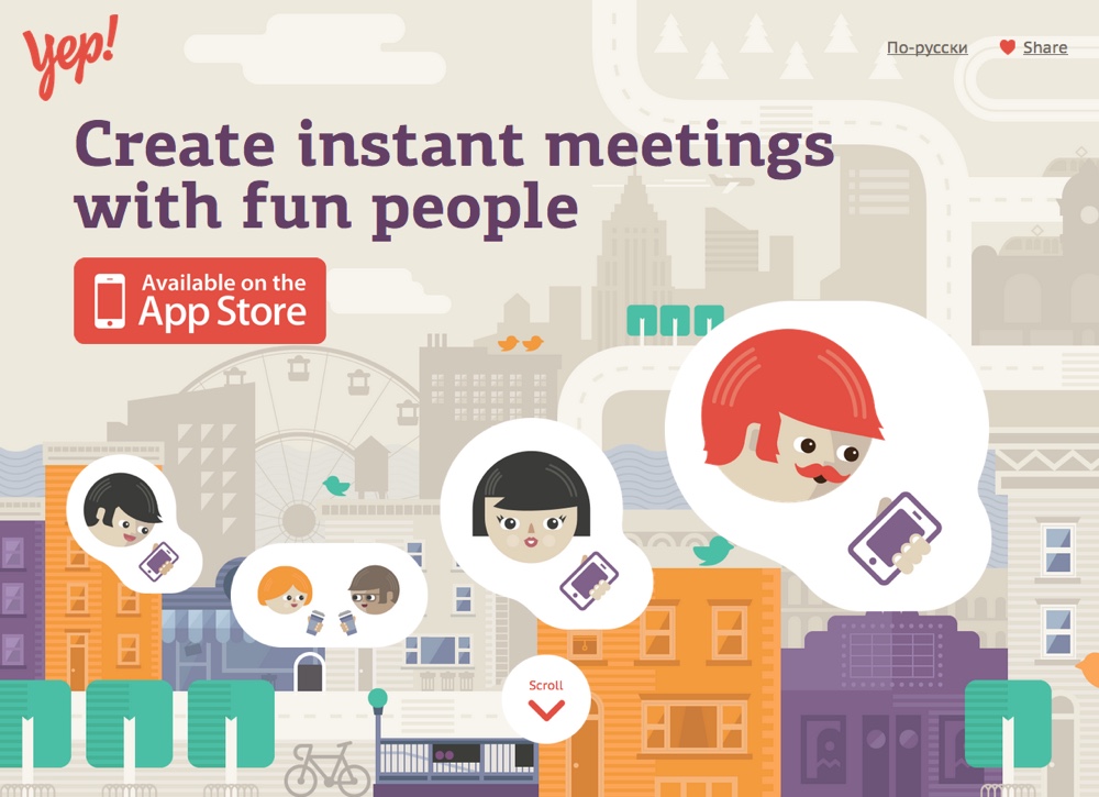
Yep! is an iPhone app designed to help you meet interesting people. The website uses a cheerful color palette and simple illustration style. As you scroll down the page, you are introduced to features of the app with charming scroll animations.
7. Video Backgrounds
Video is so much more atmospheric than still images. Sure, you could hit me with a touched-up professional photo of your employees collaborating; but seeing them collaborate in video is more convincing and immersive.
In 2016, better internet connections will mean more video backgrounds. Just keep in mind, since there is content in front of your video, to follow these best practices.
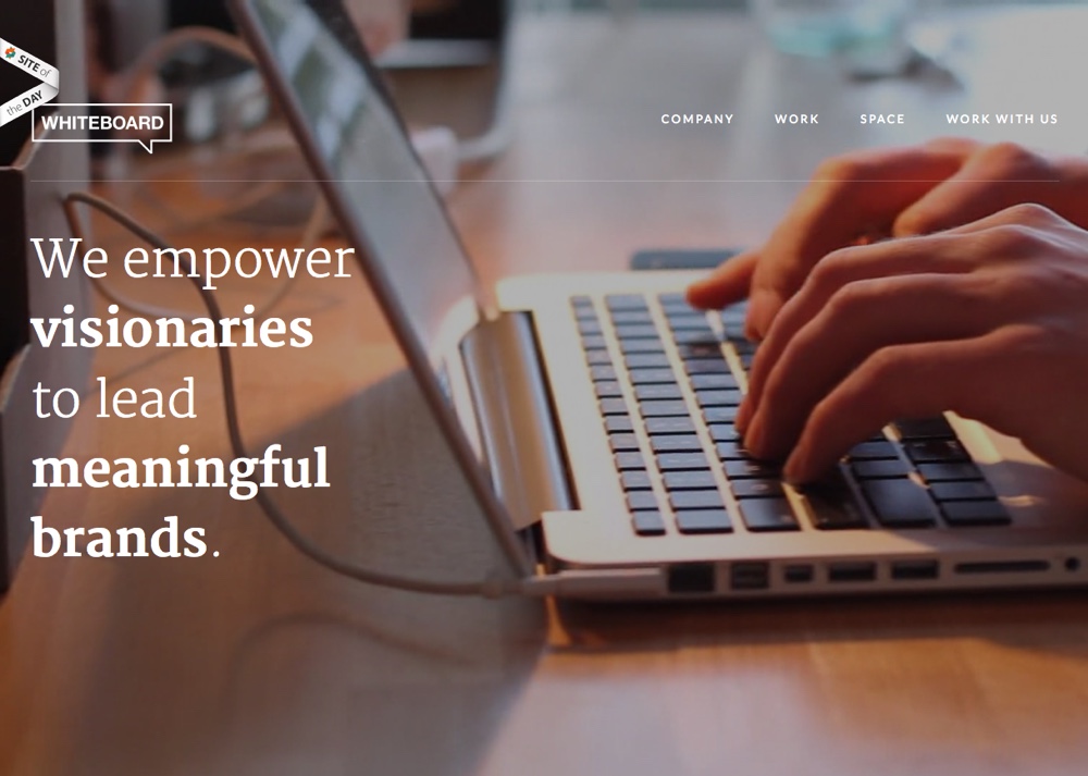
Whiteboard uses a video background to introduce their employees and the way they operate with visitors right from the beginning. As a marketing agency, their people are their greatest asset, and they show it with this video.
8. Personalized UX
In 2015, we saw a rise in awareness of the importance of UX. In a flooded market, where nearly every idea has already been played out already, the only way left to stand out is to go above and beyond in delighting your users. You can do this by providing more and better features, by giving your users what they need before they know they need it, and making boring tasks more of a delight.
You can do this by providing more and better features, by giving your users what they need before they know they need it, and making boring tasks more of a delight.
In 2016, we will see that newfound awareness play out with interfaces that go out of their way to be intuitive, interactive experiences in content that is typically static, and sites that personalize themselves depending on who you are and what you are doing.
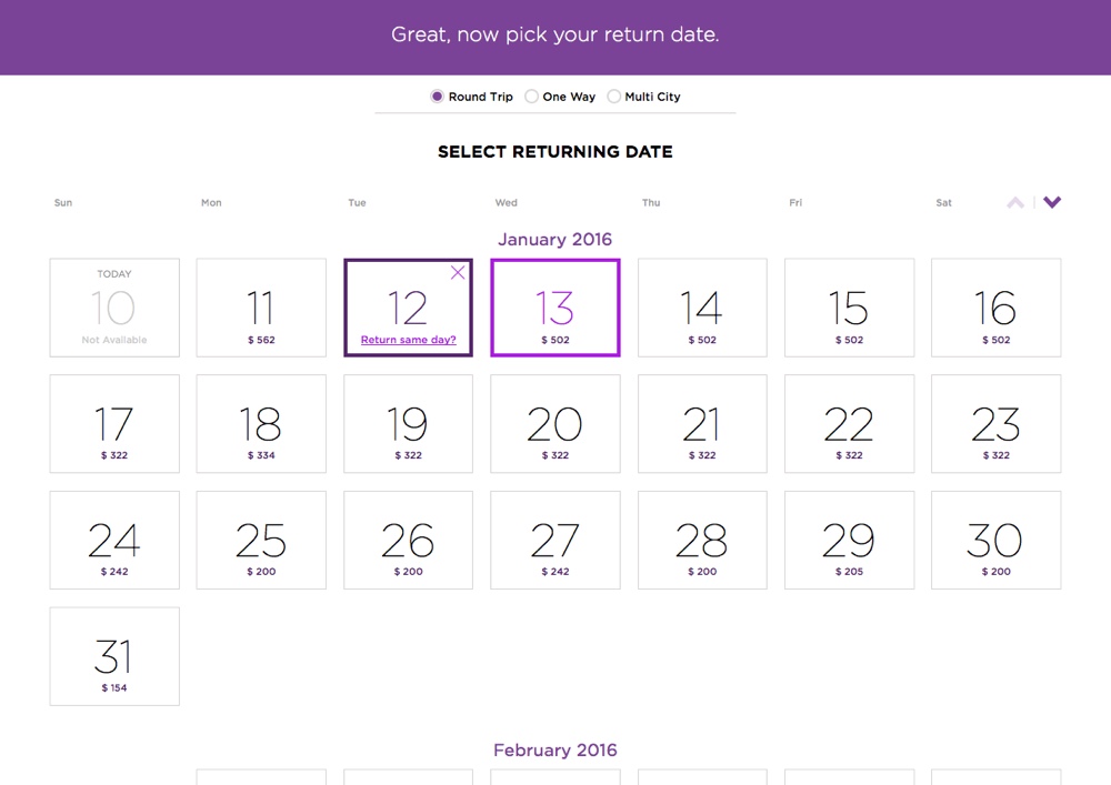
Virgin America doesn’t just leave you alone with generic instructions about how to book your flight – friendly, personalized guidance pops down from the top of the page in purple to tell you what to do next, every step of the way. It all adds up to making the process of booking your flight a lot like talking to a real person.
Wrapping Up
This isn’t an exhaustive list; there’s no telling, yet, what brand new trends will explode onto the scene in 2016. However, looking back at what happened in 2015, these are the features and effects we expect to really come to their own this year.
Everything comes down to function this year, and how form will follow it to result in a great experience for the user.
What other trends do you see getting big in 2016? Share your favorites in the comments below!

