12 Inspirational eCommerce CTAs & What Makes Them Tick
ADRIENNE WOLTER | 4 SEPT 2015
You’ve got a beautiful site. It’s responsive, so it even looks great on small screens. Your product or service is described and shown off with brilliant product shots.
But where are all the customers?
Well, if you want your visitors to turn into customers, you better have strong calls to action.
A call to action, also known as a CTA, is the content or copy that drives a visitor to do something on your website. They can take many forms, but typically they involve at least a line of text describing the product or service in a compelling way, and feature a button with some kind of action verb on it – “sign up,” “get started,” “try it now,” etc.
A strong call to action isn’t just important for eCommerce sites – where you are trying to drive customers to make an online purchase – but I would argue that they are important for any kind of website, from a blog (where you want people to subscribe to the newsletter) to a personal portfolio (where you are driving people to take a look at your work or to contact you). So learning what makes an effective one is pretty essential!
In this post, I’m going to explore three varieties of stellar CTAs I’ve seen on eCommerce sites specifically: the tried-and-true copy and button, the search bar CTA, and interactive CTAs, a new and exciting trend.
Simple Copy & Button CTA
Many websites follow this formula above the fold: An eye catching product description in a large font size. Maybe a supplemental sentence or two, smaller, underneath. And a big, bold, contrasting button to tie it all together and tell the reader where to head next.
There’s a reason that this simple form of CTA is used thousands upon thousands of times across the world of eCommerce sites – it works!
Sometimes there is just one button, one place to go. Sometimes there are multiple options. Sometimes you need to enter a little information before you can click the button, such as an email address. But once you click that button, you are beginning a path that hopefully, for the eCommerce site in question, ends with a sales.
1. Dollar Shave Club
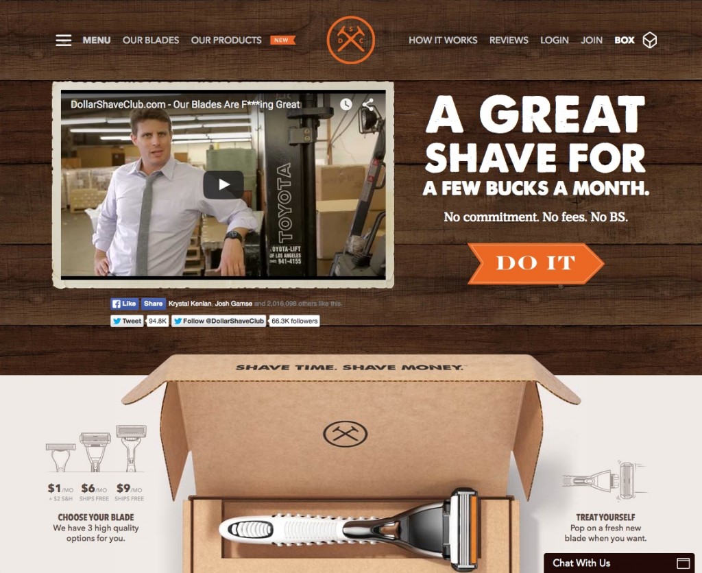
Dollar Shave Club’s introductory copy and CTA match the frank but fun tone they use elsewhere on the site:
A great shave for a few bucks a month. No commitment. No fees. No BS. DO IT
The description is concise but gets everything you need to know across. The orange button matches a few key components – their logo, a small banner indicating that they have new products, and even a band at the top of the pictured razor. Still, it pops off of the wood-patterned background.
2. Jazz
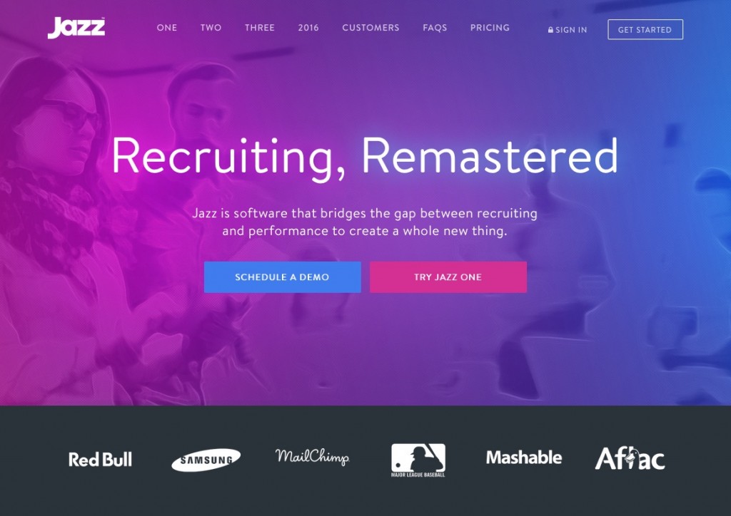
Jazz, a brand of recruiting software, has a distinctive magenta and blue gradient that they use for design features all over their site. This set of colors is used to highlight two CTAs of equal importance:
Schedule a Demo
Try Jazz One
These two options pull up sign up forms tailored to the user’s goal, regardless of which button they choose.
3. Code School
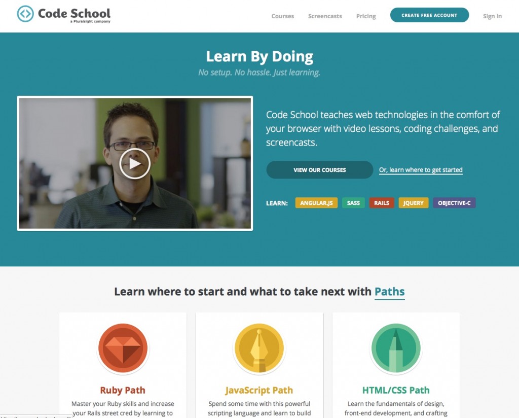
Code School’s homepage is attempting to cater to a variety of audiences. A primary CTA button invites those who know they want to learn to code with the copy “View Our Courses.” But there is a secondary CTA, presented as a link instead of a button, that exists to guide someone who might not know which course they would want to take:
Or, learn where to get started
This secondary option indicates that they are welcoming to new coders, and want to be genuinely helpful in their decision about what to learn.
Finally, a smaller set of colored buttons lead directly to the course pages of some of their most popular courses, for visitors who know exactly what they are looking for.
4. Charity: Water

Charity: Water hopes to drive their visitors to create their own campaigns geared towards raising money to bring clean water to those less fortunate. This is a pretty engaging landing page; a video showing different campaigns plays in the background while the text describing what kind of campaigns you can hold scrolls through a variety of options:
You can lose weight for clean water.
You can shave your head for clean water.
You can make a music video for clean water.
You can bake cookies for clean water.
You can host a garage sale for clean water.
(etc.)
The CTA button sits nearly centered above the fold, and is a contrasting color seen nowhere else on the page. But the color choice still makes a lot of sense – it’s all about water, after all! A secondary CTA link sits below the button, giving visitors the option to just donate instead of starting a campaign.
With the background video, contrasting button, and scrolling ideas for campaigns, this is one of the most effective CTAs I’ve seen for a while!
Search Bar as CTA
Sometimes just a button doesn’t make sense to get a user where they need to go. In a case like this, sometimes a search bar is more appropriate. The search bar as CTA is ideal for situations where you want to get your visitors browsing right away, or the service is dependent on a lookup.
With the pervasiveness of Google, users have become accustomed to browsing the web with a search box. Set it up well, and a search box is often the fastest way to get users exactly where they want to be on larger websites. For example, Facebook, the world’s largest social network, is completely navigable via the search bar.
5. Catylist
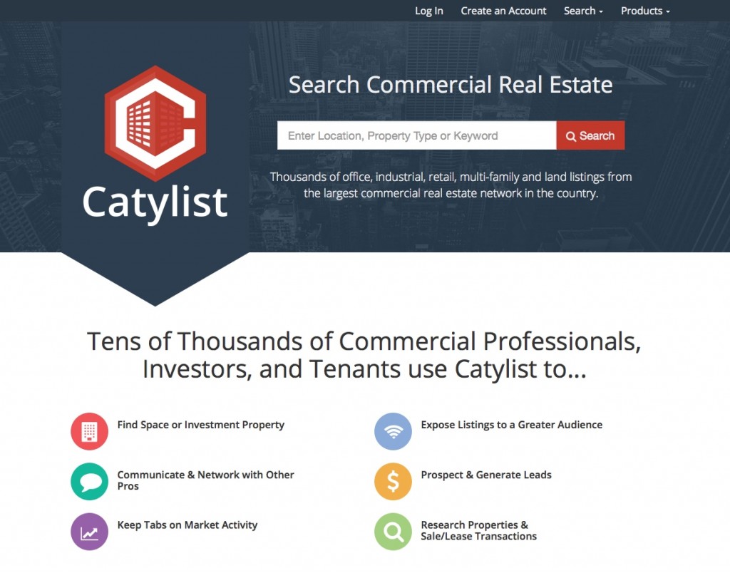
Commercial real estate search tool Catylist invites users to start their search with the following CTA:
Search Commercial Real Estate
Enter Location, Property Type or Keyword
It is simple, gets right to the point, and informs the visitor of all the different ways they can search, all at the same time.
6. iStock
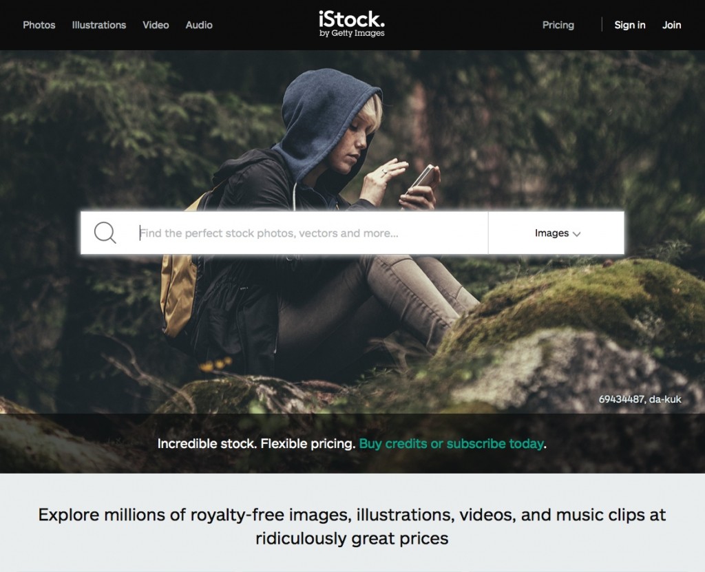
Stock photography provider iStock features two CTAs prominently on their website:
Find the perfect stock photos, vectors and more…
Incredible stock. Flexible pricing. Buy credits or subscribe today.
The first CTA is within the central, oversize search bar, with options to choose between different types of stock visuals and audio. The second is a link towards the bottom of the hero area. This solution presents a clear path both to people trying to find the right image, and for people who want to set up a subscription.
7. FontShop
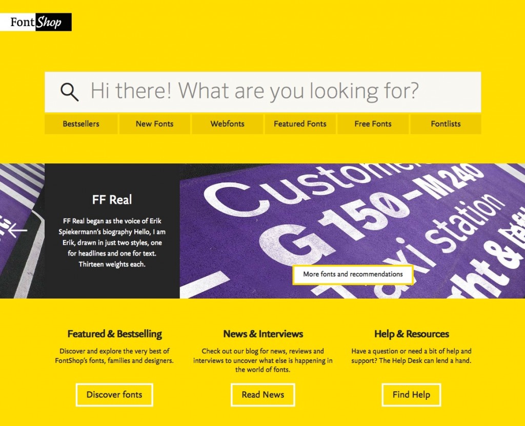
FontShop’s bold yellow and black website also features an oversize search bar at the top of the main page. The CTA takes the form of a question:
Hi there! What are you looking for?
Six buttons below the search bar give additional options for things visitors may be looking for, like new fonts or free fonts.
This is a friendly and functional way to get people using your search bar.
8. Zillow
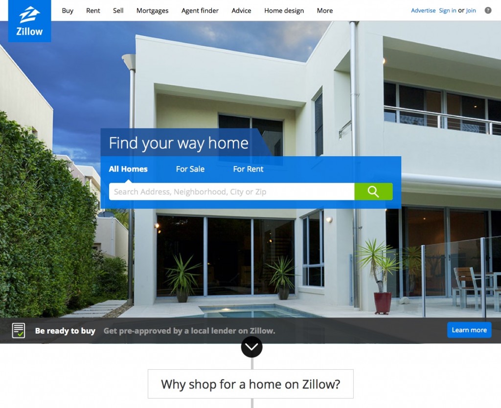
Real estate search giant Zillow places a search bar front and center, with tabs to search homes, rentals, or sale properties. The blue container for the search box includes their catchphrase (“Find your way home”), which also serves as a pretty strong CTA.
The green search button stands out against the blue and against the rotating photos behind, which all include small pops of green.
Interactive CTAs
Recently, interactive CTAs have been making an appearance. These CTAs sometimes offer another way to customize where you’re about to go on the website; sometimes, they just give users something to play with. Either way, they are unique, and offer a greater sense of value and customization than a static CTA.
Two types of sites seem to use these CTAs more frequently: travel booking sites, where information about dates and number of travelers is essential to the booking process, and financial websites, where it is important to know what kind of numbers you are dealing with.
9. Kayak
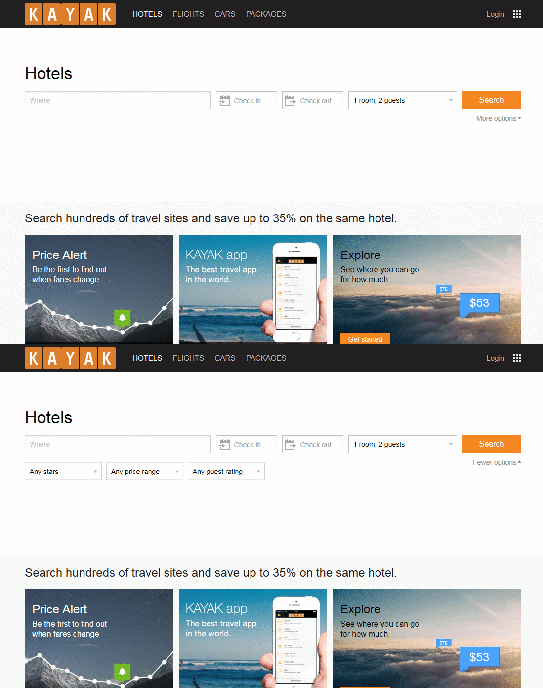
Flight deals search tool Kayak follows your typical travel booking format: a text field for a location, arrival and departure dates, and number of travelers. A small pop-down gives you options to specify ratings and price ranges.
While this format is familiar from other booking sites, Kayak stands apart because of the space they allow their form to occupy, leaving plenty of whitespace before leading on to other content.
While experts tend to recommend avoiding simple words like “Search” or “Submit” on CTA buttons, it works here, where the emphasis is on researching the available options to find the best deal.
10. Credit.com
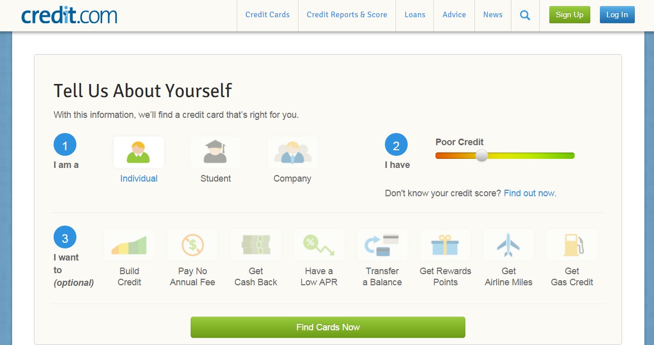
The credit card comparison tool on Credit.com gives the user icons and a slider to describe their situation before clicking the “Find Cards Now” button. The result is something more intuitive and fun than what can be achieved with drop downs.
11. Nimble
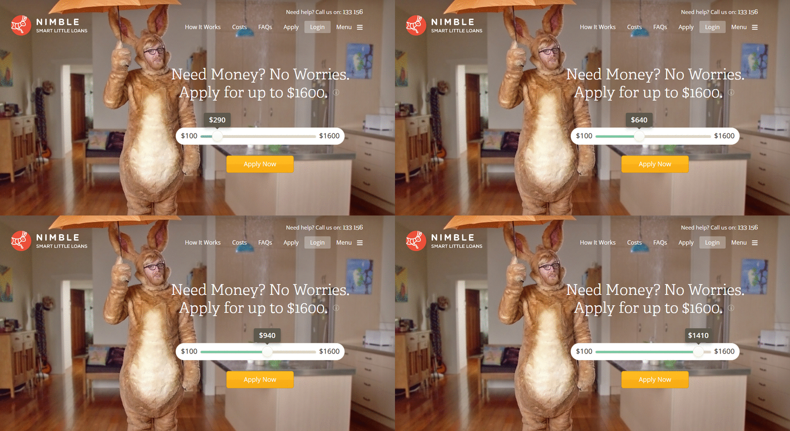
Nimble is a simple loan service. Their CTA is simple, too:
Need Money? No Worries. Apply for up to $1600.
Apply Now
In between the copy and the button is a slider that allows you to select any amount between $100 and $1600. The button stands out as a unique color on the page while still echoing warm tones in the hero image and logo.
12. Earnest
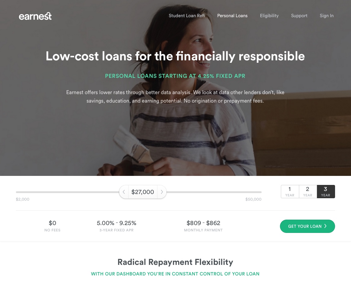
Earnest is another loan service, but with more options. There is a slider to choose the loan amount, and options to repay in one, two, or three years. As you make your choices, the fee, fixed APR, and monthly payment information update below. A bright green CTA button reads “Get Your Loan,” making the visitor look forward to a quick and easy application process.
The Importance of the Button
So, what do all the inspiring CTA examples above have in common?
They all prominently feature buttons!
People crave having a button to click on or other elements to interact with. A button tells your visitors that there is a next step, that there is more to see.
The most important feature of your CTA buttons is their text. As I said earlier, highlighting an action is essential. It is a call to action, after all.
Less important qualities include color, size, and placement. Generally, you want a button that contrasts well with the colors behind it, is large enough to be noticeable but not so large as to seem like a trick, and that is placed above the fold (although if your product requires a long explanation, it may be more effective placed near the bottom).
To make sure your CTAs are converting as well as they should be, you should split test them with other variations. This great piece by Digital Marketer details some things you should split text, and some things you shouldn’t bother with.
That’s it! Those were my inspiring eCommerce CTA examples, but I would love to see some of yours. Share the best CTAs you’ve seen recently in the comments below!

