13 Secret Ways to Subtly Influence Conversion Rates
Are you doing everything you can to take advantage of the traffic your website receives each day?
Maybe you already have tried all the obvious ways to influence conversion rates. You can contrast the color of key page elements or vary the size of your call-to-action, but when you’ve exhausted the basic tricks it’s time to get creative.
Conversion Rate Optimization (CRO) is integral to succeeding in an online marketplace, no matter what product or service you are selling.
Here are a baker’s dozen of subtle changes – backed by a bit of science, no less – that are sure to improve your odds of getting what you want out of your site’s visitors.
1. Lower the Number of Form Fields
Less is more, especially when it comes to convincing people to fill in their information.
One case study showed that even as little as a single additional field to fill in can cost you conversions, in the ballpark of an 11% decrease.
When seconds are valuable and a moment’s decision makes or breaks your conversion effort, facing your visitor with as little upfront work as possible is a great start to improving your website’s odds.
But what should you do when you want more than the bare minimum from your users?
2. Use Multi-Step Forms
These fields don’t necessarily need to all disappear!
Once a guest has already made their decision to provide you with their email, it is much easier to secure a name and other necessary information in subsequent forms that are initially hidden.
This plays into a stubborn tendency of the human brain known as the “sunk cost fallacy.” We are all more likely to see a menial task through once we’ve started, even if it exceeds what we would have originally considered reasonable.
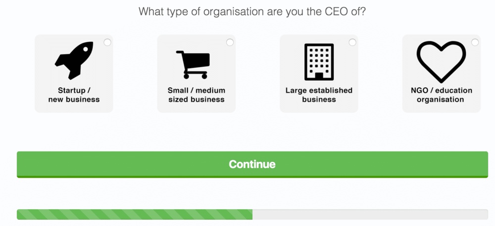
This is a powerful tool, with one case study showing as much as a 743% increase in CRO from the use of multi-step forms.
With this trick, tackle new forms and revise old ones with a new type of “divide and conquer” philosophy in mind!
3. Add Real-Time Form Validation
Nobody wants to slog backwards through a form they’ve worked to fill out, only to find that some minor error needs to be corrected.
We’ve all seen real-time for validation in action, rejecting passwords we’d easily remember in favor of ones we need to reset every time we log in.
There is something to say for real-time validation’s efficacy, though, with a 22% increase in conversion rates, and get this – a 22% decrease in errors made – in one case study.
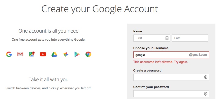
Like many items on this list, this is easy to implement, too. Make sure all emails follow the correct format and all passwords match as soon as they’re entered, and everyone involved will appreciate the reassurance.
4. Make the Phone Field Optional
Sometimes you have to lose a little to gain a lot, and that is certainly the case when requesting your visitors’ phone numbers.
One study revealed that providing some agency to the individual filling out a form yields massive gains: making the phone field optional more than doubled conversion rates overall, while costing only 37% of phone numbers.
These are the sorts of decisions you need to make when you add a form of any kind to your site.
Maybe next time you revisit your form design strategy, consider leaving more up to those on the other end. You’ll be surprised how much they’ll appreciate the option to skip a question.
5. Remove Captchas
This article sums it up nicely: A captcha frustrates your human users in exchange for very little true protection from automated spam.
For a long time they had been standard place on the Internet, but many have opted out of including captchas in recent years, and the benefits are clear.
A 33% increase in conversion rates is nothing to scoff at, and to make it even better, you can have the benefit of a captcha at the same time you benefit from not having it.
How?
Try trapping spambots with a hidden field, known as a “honeypot” captcha. This is a hidden field that goes unseen by your users, but will be filled unerringly by robotic pests, putting you back in control again when you discard their rubbish information.
6. Create Scarcity
Don’t be afraid to put some pressure on your customer and add a sense of urgency to their decision to place that order.
Sites such as eBay and Amazon do this well, harnessing a person’s desire to act in a way that keeps them in control.
There’s nothing like a “Only 4 left in stock!” or “Want your order by ___? Order within ___ hours” to get people’s attention and drive an impulse purchase home.
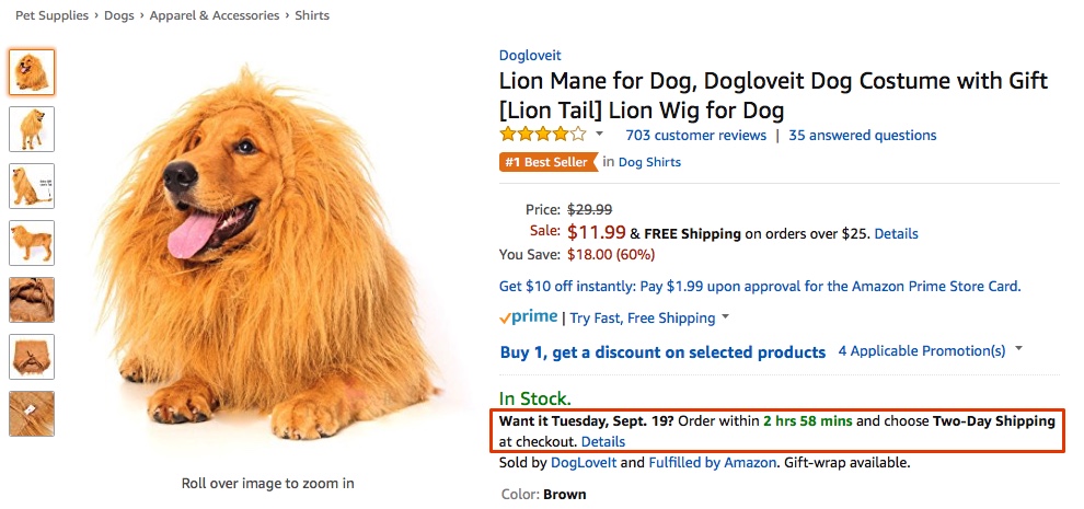
The web often doesn’t feel time-sensitive, but adding something as simple as a statement like this can lock a user firmly into a clock of your creation, where they run the risk of missing out – unless they do what you want them to.
7. Remove Distracting Page Elements
You’ve worked hard, and you want your users to see what you are about and what you’ve got to offer.
However, when you are trying to hone your conversion rate, all page elements that do not directly contribute to that goal can be done without.
This study shows how removing something as essential as a navigation bar was able to drive up a site’s conversion rate by over 100%.
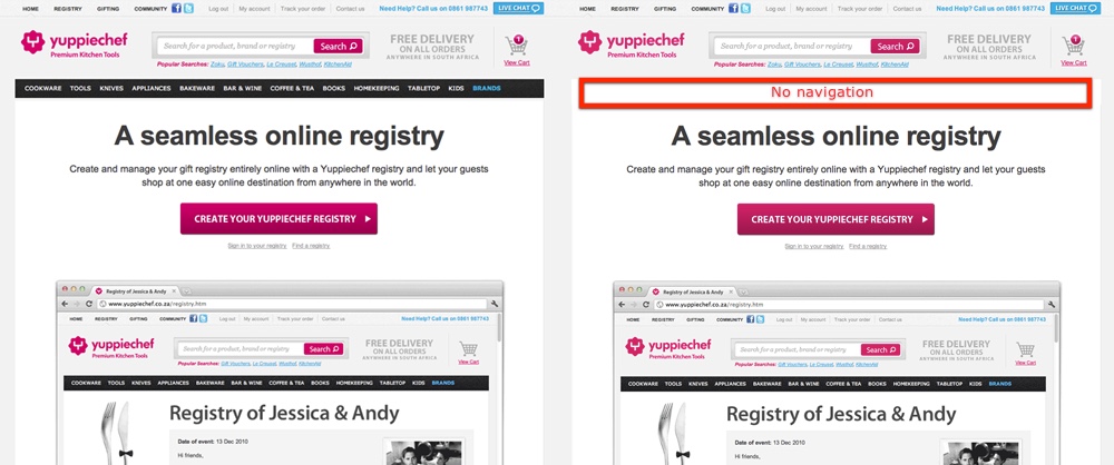
If you want to see similar results, consider whether your landing page is being overly-diluted by these elements, and A/B test the page without them.
8. Use a Single Column Layout
Humans are simple creatures, and we like simple layouts. Utilizing a single column to hold all of your landing page’s vital content, CTA, and forms gives it a natural flow as the user scrolls down the page, all while removing all those distracting elements I just mentioned.
Don’t take my word for it, though. This study’s results speak for themselves, and a 681% increase in conversions makes this one of the most promising secrets in this post.
Definitely make the single column layout a central tenet of your design philosophy for landing pages moving forward.
9. Denote a “Most Popular” Tier
When a user has to pick between the free trial, a standard edition, and the mega-deluxe package, it is clear that slapping an eye-catching badge on a central option reels in extra conversions.
Software suites have taken advantage of this tactic for years, removing the paralysis of choice that people tend to get locked into and encouraging a “bandwagon effect” – after all, it is the most popular choice, so it can’t be that bad.
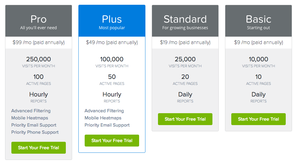
In the example above from Crazy Egg, you can see how impactful the highlight and “Most popular” denotation are in action.
You can read more about this phenomenon here, along with a few other psychological tricks for increasing the conversion power of your pricing tables.
10. Take Advantage of the “Left Digit Effect”
Using the “left digit effect” is a tactic everyone is familiar with.
That doesn’t render it any less useful, though; studies have shown time and time again that a product priced at $19.99 will always outperform one priced at $20 flat.
As negligible as a single cent is, it holds all the sway in the world when it comes to this pricing strategy.
Always follow the 99-cent rule when you are deciding what your customers will pay, and their frugal minds will drive them to spend more than they ever have before.
11. Use Content Upgrades
People like to feel as though they are getting something in return for their time invested, and more than that, they want to feel elevated above their peers.
Content upgrades are a somewhat recent trend wherein a blog post will feature a link to some form of bonus content. If you want that bonus content, all you have to do is sign up for an email newsletter.
Ironically, when the conversion is presented as a minor aside to a meaningful upgrade of some sort, it is much easier to secure – 781% easier, according to this study by Brian Dean.
Creating something unique only to keep it behind lock and key may seem counterintuitive, but it could be one of the most effective CRO tactics you ever implement.
12. Use Humor
This may seem obvious, and it is. The effect of light-hearted writing is minor, but few changes are easier to implement.
Let your hair down, loosen your tie, and laugh with your visitors, and you can enjoy a 17.9% boost to your CRO.
Not every brand needs to be linked to clinical professionalism, and you may even enjoy producing your content more without it.
13. Offer a Free Shipping Threshold
Finally, a well-known tool on Amazon’s belt, and it is a heavy-hitter in promoting sales.
High shipping costs and no way around them is one of the chief causes of abandoned shopping carts.
Setting a reasonable spending limit that must be passed to do away with those costs dramatically increases the number of sales.
This study showed a 90% increase in orders placed, and a 7.23% increase in the average value of these orders, and those are not numbers to leave untapped.
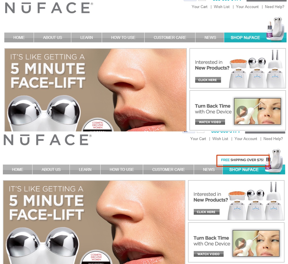
Be sure to work a free shipping threshold into your eCommerce website, because our brains are wired for it. The fact is that many customers will happily spend an extra $20 to get out of that $4 shipping and handling fee.
Wrapping Up
You made it! That was a lot of conversion rate advice in one brief post, so here is the quick list of concepts to take home:
- Lower the Number of Form Fields
- Use Multi-Step Forms
- Add Real-Time Validation to Your Forms
- Make the Phone Field Optional
- Remove Captchas
- Create Scarcity
- Remove Distracting Page Elements
- Use a Single Column Layout
- Label One Service Tier “Most Popular”
- Take Advantage of the “Left Digit Effect”
- Use Content Upgrades
- Use Humor
- Offer a Free Shipping Threshold
So there you have it: 13 secret strategies to subtly increase conversion rates. Even better, most of these are very quick and easy to implement.
Do you have any other tips to share? Speak your mind in the comments below!
