7 Logo Design Trends to Watch in 2019
Are you ready to launch your new business and you want to design the perfect logo?
Or maybe your company’s original logo doesn’t quite fit your brand’s current focus or target demographics and its’ time for a brand update?
Perhaps you’d never thought about a logo design for your business before—and you wouldn’t be the first—and you figured now is the time to invest in this vital visual element for your business.
Since logo trends shift fairly regularly, you may find yourself wondering where and how to begin your quest for the perfect logo composition to express your brand message.
Do you need something colorful?
Should your design touch on some larger cultural phenomenon?
Is it better to keep it simple and true to your brand voice?
Take a look at these 7 logo design trends that are sure to dominate both brand new logo designs and logo rebrandings this year.
1. Responsive Design Logos
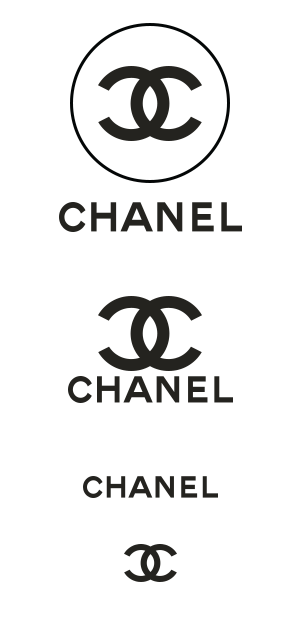
What’s are responsive design logos? Just like responsive web design, these are shape-shifting logos that change base on the size screen on which you view the website.
These logos can have several different looks, size, complexity and even color.
Responsive design logos are the perennial classics of the branding realm, offering maximum versatility and flexibility of use.
Here’ s a good example of the Chanel logo changing as the screen size gets smaller.
These logo designs work in a variety of media, including product packaging, print advertisements, marketing brochures, roadside billboards, and public transportation placements.
Responsive designs also work perfectly with your website, mobile app and business cards.
2. Minimalist
Sometimes less really is more, and that is certainly the case when it comes to designing a logo.
This relatively recent addition to logo design trends is loved for its simplicity of use as well as its bare-bones appearance. The design allows for quick loading times and easy brand recognition.
Additionally, its user-friendly aspects and simple design do not mean that this type of logo is without its own unique qualities.
Think quickly about the logo design for companies like Google, Cartier, and Netflix, and the idea should come into focus, thanks to accents and flourishes overlaying the simple and bold font.



3. Wordless Logo
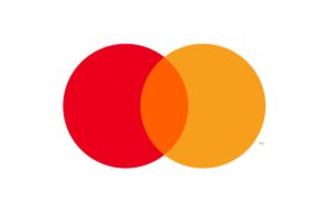
Mastercard started off 2019 with a controversial bang by rebranding their logo to a wordless logo.
They completely removed the word Mastercard from the iconic pair of interlocking red and yellow circles, where it’s been for more than 50 years.
Like it or hate it, only the biggest of brands can afford to go wordless. You’d need to be in order to rely only on an image and not a name for every consumer to recognize you.
Mastercard joins only a small stable of brands like Apple, Starbucks, McDonald’s, Nike and Target that have done the same. This is a pretty illustrious list of major brands, so although it’s a trend, it’s something we’d advise smaller businesses to be doing.
4. Logos With Hidden Symbols
Sometimes hidden text illusions can help catch the eye of the consumer.
There are many different types of hidden text illusions, from those that make you change your perspective, to some that simply require you to squit your eyes a bit.
Simply put, these are logos that trick the eye.
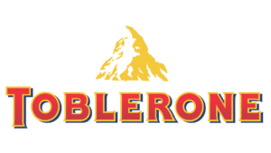
Do you see the hidden image of a bear in the Matterhorn mountain of the Toblerone logo?
The Matterhorn mountain is where Tolberone originated, and because if you live in the mountains with bears, you’ll need good chocolate to survive.
5. Overlapping Elements and Shadows
Another simple but effective logo design trend is overlapping elements. The overlap may take place over a single letter, word or shape, or the overlap may cover the entire original combination of elements.
Try using different shapes and shades to build a variety of wordmarks, watermarks, pictorial marks and more.
Additional twists on this design include the inclusion of geometry, negative space and splashes of color.


6. Negative Space
Part of a continuing trend that’s gained momentum from last year, using negative space is a simple way to make a logo more visually interesting.
This stylistic flourish can add an air of mystery and sophistication to an otherwise basic design.

7. Geometric Shape
Using geometric shapes can work as powerful, memorable symbols.
Each shape communicates a different message to audiences.
A circle, for example, can project positive emotional message, a sense of unity and commitment to a single focused gold, strength, and steadiness, and a sense of bonding.
It’s no wonder why the Olympic logo is comprised of nothing but circles.

We’re also seeing logos using a combination of different geometric shapes to form the symbol. Zendesk recently rebranded their logo quite effectively by doing this.
Do You Need to Tweak Your Own Logo Design in 2019?
There has never been a more exciting time in logo design since no single style is pushing the others out of the marketplace.
There’s room for any of the trends mentioned here or something else altogether. And of course, the logo design trends from 2018 are still very popular.
Innovative designers are either taking existing trends to new levels or melding two or more trends together for some exciting hybrids.
Remember to keep an open mind when you strike out to create a new logo or spruce up your existing design because the possibilities are endless.

